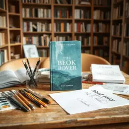

As a debut author, the journey into book cover design can be overwhelming, but understanding its significance is crucial. A well-crafted cover is not just a design; it’s the first handshake with potential readers, and it can be the difference between a book that gets noticed and one that fades into obscurity.
What You Will Learn
- The importance of a professional book cover in attracting readers and conveying your story's genre and tone.
- Key elements of effective cover design, including typography, imagery, color palette, and composition.
- How to choose typography that reflects your book's mood and ensures readability.
- The psychological impact of color choices and how they can influence reader emotions and genre expectations.
- Genre-specific design norms and how understanding these can enhance your book's marketability.
- The value of researching successful book covers in your genre to inspire your own design choices.
- The concept of visual hierarchy to guide readers' attention effectively on your cover design.
Impact of Book Cover Design on Reader Perception
Research indicates that the design of a book cover significantly influences reader interest and engagement. Below are key statistics and comparisons that highlight the importance of effective book cover design. For more tips on crafting your story, consider these fiction writing tips and practices.
75% of Readers Judge a Book by Its Cover
This statistic underscores the critical role that an appealing cover plays in attracting potential readers, especially for debut authors.
Key Elements of Effective Design
- Typography
- Imagery
- Color Palette
- Composition
Attracts Attention
A well-designed cover is essential for standing out on crowded shelves or digital platforms.
Conveys Genre
The design signals the genre of the book, helping readers quickly identify their interests.
Builds Credibility
Professional design gives books a polished look, making readers more likely to take them seriously.
Understanding the Essentials of Book Cover Design for Debut Authors
As a first-time author, diving into the world of book cover design can feel a bit daunting. However, it's essential to remember that a professionally designed cover is your first opportunity to attract readers. A great cover not only catches the eye but also conveys the genre and tone of your story, setting the stage for what lies inside.
When I started working on my debut novel, I quickly realized just how crucial a good cover could be. I found that it wasn't just about aesthetics; it was about creating a connection with potential readers. An engaging cover can draw readers in, while a poorly designed one might send them scrolling past your book without a second thought!
Why Book Cover Design Matters for First-Time Authors
The right book cover can significantly impact your book's success. It serves as a visual representation of your story and plays a key role in attracting your target audience. Without an appealing cover, even the most captivating story can get lost in the vast sea of titles available today. To ensure your novel truly shines, make sure to edit your first novel well.
Consider this: according to research, 75% of readers judge a book by its cover! That means investing time in understanding cover design is not just a nice-to-have; it's a necessity for first-time authors aiming to make a mark.
- Attracts Attention: A well-designed cover grabs readers' interest on crowded shelves or digital platforms.
- Conveys Genre: The design helps signal what type of story it is—mystery, romance, fantasy, etc.
- Builds Credibility: A professional look can give your book a polished impression, making readers more likely to take it seriously.
Essential Elements of Effective Book Cover Design
As you start thinking about your book cover, it's important to understand the core elements that come together to create an effective design. Here are the key components you should consider:
- Typography: The choice of fonts can set the tone and style of your book.
- Imagery: Photos, illustrations, or graphics that align with your story can enhance emotional impact.
- Color Palette: Colors can evoke feelings and attract the right audience, so choose wisely!
- Composition: The layout of elements on the cover impacts how it catches the eye.
Each of these elements works together to create a cohesive look. As the founder of First Novel Navigators, I've seen how a well-thought-out design can transform a book's appeal. Remember, this is your debut; let your cover reflect the hard work and creativity you've poured into your writing!
The Role of Typography in Book Cover Design
Typography is more than just picking a pretty font. It communicates the mood of your book and helps convey important information at a glance. For instance, a whimsical font might be suitable for a lighthearted romance, while a bold, serif typeface could work well for a serious thriller.
When selecting fonts, consider these tips:
- Readability: Ensure your title is easy to read from a distance.
- Contrast: Use contrasting colors between text and background for clarity.
- Limit Font Choices: Stick to two or three fonts to maintain a clean and professional look.
Typography reflects your book's personality, so take time to choose fonts that truly represent your story. As I often remind writers at First Novel Navigators, your cover is the first impression readers will have—make it count!
Understanding Color Theory for Cover Design
Colors play a significant role in evoking emotions and attracting readers. Understanding basic color theory can help you make informed choices for your book cover. For example, blue often conveys trust and calm, while red can evoke excitement or urgency. To further enhance your writing, explore writing tips for new novelists.
Here are some key points to consider when choosing your color palette:
- Psychological Effects: Colors can influence feelings—think about what emotions you want your readers to feel.
- Genre Association: Certain colors are commonly linked to specific genres. For example, dark colors may suggest suspense, while bright colors might indicate a light-hearted story.
- Consistency: Ensure your colors align with your overall branding as an author.
Taking the time to understand color theory can greatly enhance your cover's appeal. At First Novel Navigators, I encourage authors to experiment with color palettes that resonate with their story's essence!
Quick Summary
Here's a brief recap of the key points discussed so far:
- A professionally designed book cover is crucial for attracting readers and conveying your story's genre and tone.
- Key elements of effective cover design include typography, imagery, color palette, and composition.
- Understanding your genre's visual language can enhance your book's marketability and ensure it resonates with your target audience.
Navigating Genre-Specific Design for Debut Authors
As a first-time author, understanding the visual language of your genre is crucial in crafting a book cover that resonates with your target audience. Different genres come with their own set of design norms and expectations, and recognizing these can significantly enhance your book's marketability. Your cover not only needs to attract readers but also to clearly communicate what type of story lies within its pages.
For instance, a romance novel might feature soft colors, elegant fonts, and imagery that hints at love and emotion, while a thriller might use bold colors, sharp fonts, and dramatic visuals to evoke suspense. Each genre signals its distinct vibe through cover design, and as a debut author, it’s essential to align your cover with these expectations. Remember, you're speaking to potential readers before they even pick up your book!
Identifying Genre Expectations in Book Covers
Let’s take a closer look at how genre expectations shape book cover designs. Here are some common traits:
- Romance: Soft colors, flowing typography, and imagery of couples are typical.
- Fantasy: Rich, vibrant colors with mythical creatures or landscapes to entice readers.
- Thriller: Darker tones, bold typography, often with an element of mystery or danger showcased.
- Non-Fiction: Clear, professional designs that convey authority and trust, often featuring the author’s name prominently.
By analyzing these expectations, you can start to formulate ideas that align with your book’s message. It’s like putting a puzzle together; each piece helps create a bigger picture that attracts the right readers!
FAQs about Book Cover Design for Debut Authors
- Why is a professional book cover important for debut authors?
- A professional book cover is the first point of contact with potential readers. It attracts attention, conveys the book's genre and tone, and builds credibility, significantly influencing a reader's decision to pick up or purchase your book.
- What are the key elements of effective book cover design?
- The key elements include typography (font choices), imagery (photos, illustrations), color palette (colors used), and composition (layout of elements). These work together to create a cohesive and appealing visual.
- How does typography impact a book cover?
- Typography communicates the mood and genre of your book. Readable fonts, good contrast, and a limited number of font choices (2-3) ensure clarity and professionalism, reflecting the book's personality.
- What role does color theory play in cover design?
- Colors evoke emotions and influence reader perception. Understanding color theory helps authors choose palettes that align with the desired emotional response, genre associations (e.g., dark for suspense, bright for lighthearted), and author branding.
- Why is genre-specific design important?
- Genre-specific design helps your book resonate with its target audience by meeting their visual expectations. For example, romance covers often feature soft colors, while thrillers use bolder, darker tones, signaling the type of story to potential readers.
- How can debut authors research successful book covers?
- Debut authors should analyze over 100 covers in their genre from online bookstores or libraries. This involves noting recurring themes, styles, colors, images, and fonts that stand out and considering how to adapt these elements for their own design.
- What is visual hierarchy in book cover design?
- Visual hierarchy guides the reader's eye to the most important elements on the cover. Typically, the title is most prominent, followed by the author's name, then imagery, and finally a tagline, ensuring key information is easily digestible.
Researching Successful Book Covers in Your Genre
To truly understand what resonates within your genre, I recommend diving into research. Take a look at over 100 book covers from your genre! This exercise can illuminate recurring themes and styles. Here’s how to approach it: To learn more about getting your book out there, consider our guide on how to publish your first novel successfully.
- Visit online bookstores or genre-specific sections at local libraries.
- Take screenshots or photos of covers that stand out to you.
- Analyze what works: consider colors, images, fonts, and overall composition.
- Note the common elements that seem to attract you and think about how you can incorporate or adapt them into your design.
By gathering this visual inspiration, you'll better equip yourself to create a compelling cover that aligns with established genre conventions while also showcasing your unique voice as a writer. Remember, at First Novel Navigators, we believe in empowering you with the tools and insights necessary to make your literary dreams a reality!
Understanding Visual Hierarchy in Design
Lastly, let’s touch on an essential aspect of cover design: visual hierarchy. This principle helps guide a viewer’s eye to the most important elements of your cover. Here are some key points to keep in mind:
- Title: Should be the most prominent feature, easily readable from a distance.
- Author Name: It usually comes next, but its size can vary based on your recognition in the market.
- Imagery: Use images that complement your title and reinforce the book’s theme.
- Tagline: If you have one, position it strategically to add intrigue without overcrowding the design.
By prioritizing these elements effectively, you’ll create a book cover that not only looks great but also communicates your story's essence instantly. Remember, it's all about making a strong first impression—something every debut author should strive for! For additional support, consider these editing tips for new authors.
Recap of Key Points
Here is a quick recap of the important points discussed in the article:
- Importance of Book Cover: A well-designed cover is crucial for attracting readers and representing your story's genre and tone.
- Essential Design Elements: Focus on typography, imagery, color palette, and composition to create a cohesive and appealing design.
- Typography Matters: Choose readable fonts, maintain contrast, and limit font choices to convey your book's personality effectively.
- Understanding Color Theory: Select colors that evoke the desired emotions and align with genre expectations to enhance your cover's appeal.
- Genre-Specific Design: Recognize common cover traits in your genre to communicate effectively with potential readers.
- Research Successful Covers: Analyze other book covers in your genre to identify trends and inspire your own design.
- Visual Hierarchy: Prioritize design elements like title, author name, imagery, and taglines to guide readers' attention effectively.